A landing page is an essential part of your marketing and sales strategy. Simply put, it’s one of the most important elements in lead generation and the highest converting page a business can create. While most homepages have a conversion rate of around 1-3%, a good landing page converts 5-15% of visitors (and highly effective pages can see conversion rates over 30%).
It’s those high conversion rates that are the reason you want to set up a landing page in the first place. The homepage of your website has too many different messages and calls to action, while a landing page exists for one purpose only – usually to make a sale or convert your audience in some other measurable way. Getting people to sign up for a newsletter, enroll in a course, start a free trial, or purchase tickets to a conference are all examples of reasons you might want to build a landing page.
Oftentimes, landing pages are used as the first introduction to your brand, with traffic directed to this page from an ad, social media, or other online sales channel. Therefore, you’ll want to set it up for someone who’s not yet familiar with your company.
When you design a landing page, you want to have a definitive goal in mind. People end up on your page looking for a solution to a problem. This page is your chance to offer them that solution. Your offer should provide something of value, solve a problem, and compel people to act.
There are proven tactics you can include on your landing page that will help increase your conversion rates. Here, we’ll give you 7 high-converting tips to consider in your landing page design, along with landing page examples to inspire you.
1. Do your keyword research
Landing pages are often found through organic search, so your keywords and SEO tactics really matter here. The right keywords are going to help people find your page. What words do people use when addressing their problem? Try to use exact phrases and words that your potential customers are searching for.
Tools like Google Trends and Moz Keyword Explorer (both are free options) can help you to find keywords that you can rank for. Ideally, you’ll want to find words or phrases that have a high search volume but not too high of a difficulty rating.
Use your keywords in your H1 and other subheadings, as well as sprinkled throughout your body text. Don’t forget to add them into your image alt texts and meta description!
2. Create a clear call to action
Your landing page exists to convert, so your call to action (CTA) must be clear AF. Make it visually distinct, standing out on the page and drawing the user’s eye. High contrast and proper use of color are helpful here. Also, whitespace is your friend! It will help to make your CTA stand out on the page.
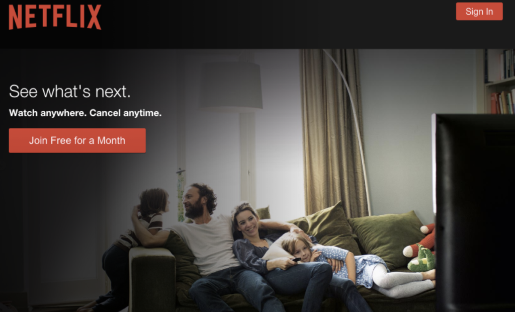
See how the use of color and space draws your eye right to the action Netflix wants you to take?
Your CTA should be simple, compelling, and effective. Use strong action words to inspire your audience to make a move. Have fun with the wording if it fits your brand, but don’t make it confusing. You want it to be super clear what action you’re asking people to take.
If you can, be sure to include a benefit in your call to action, eg “Get My Free Report”. Avoid boring action phrases that don’t help people understand what they’re going to get out of it (think “Submit” or “Register”).
Keep the most important parts above the fold – there should be a clear CTA before anyone even thinks about scrolling down.
3. Narrow your focus
Your landing page has one specific goal, so make your offer clear. Simplicity in design as well as copy is helpful to keep things straightforward. Don’t allow visitors a chance to be distracted. In fact, some experts advise that you should eliminate the navigation bar, or anything else that could distract people and get them to click off the page.
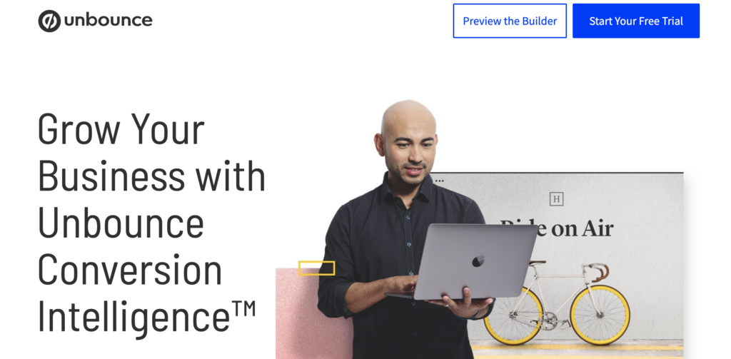
Unbounce uses simple design without distractions (notice there’s no navigation menu?) to drive conversions.
And it stands to be repeated… prioritize that CTA. Make it shine. Make it impossible to ignore.
4. Include compelling visuals
Our brains process visuals 60,000 times faster than they process text. The right images can convey a story or idea very quickly. They can also bring people in. You’ll want to include at least one high-quality, relevant image on your page.
If applicable, include a picture of your product or service. A little insight into what your prospect can expect from your business is likely to increase conversions.
5. Craft the right copy
When you write the copy for your landing page, consider your customer’s goals as well as pain points. You want to make it clear how they’ll benefit from your offering. Speak to their pain points, and let them know how your product or service will improve their lives.
Your goal is to invoke positive emotions from your potential customers. Make them feel smart. Consider how you can make them feel appreciated, understood, excited, or inspired.
To help make your offering clear, be sure to use effective headlines and persuasive subheadings. Your headline is your big chance to make your offer irresistible. Be sure to keep it simple. You don’t want to overwhelm or be overly complex. Remember, make it clear what the user is supposed to do and why.
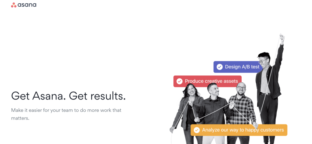
The only thing above the fold on this landing page for Asana is a simple headline and explanatory subheading. They make their offer clear while addressing how their product solves a common pain point.
In addition, establish consistent copy. If you’re pointing ads to this page, make sure your tone, value proposition, and offer are the same on the ad as they are on the landing page. Confused prospects won’t convert.
6. Inject social proof
Chances are the website visitors coming to your landing page are new to your brand. How are they going to trust that what you offer is legit? If you’ve got social proof, it needs to be in here.
Marie Forleo’s B School gives you real faces and over 200 reviews, while also reminding you there have been over 55,000 students who’ve purchased the program. Makes you feel pretty confident, right?
Testimonials, reviews, and any user-generated content is great here. You need to let the readers know that other real humans have benefited from what you have to offer.
7. Induce a feeling of safety & trust
Along with social proof, what else can you add to the page to make users feel a sense of trust and security? If your company has any certifications (think B Corp, certified organic, Hubspot Partner), be sure to include them on the page.
Always include contact information so people know they’ll actually be able to get a hold of a real human if they choose to purchase from you. Using a money-back guarantee can help customers feel safe and makes your offer a no-brainer.
As the main idea is to convert prospects, a landing page is one that’s meant to be continually updated and tweaked. Set it up so you can gather data on it to find out what’s working and what’s not. Try A/B testing and use heat maps and other analytics to optimize your page.
Lastly, always include a way to gather people’s information by having them fill out a form. This way, you capture those hot leads.
A privacy policy is a critical piece of any website.
This website uses cookies to improve your experience. By continuing use of this site you agree to our privacy policy. Cookie settingsACCEPT
Privacy & Cookies Policy
Privacy Overview
This website uses cookies to improve your experience while you navigate through the website. Out of these cookies, the cookies that are categorized as necessary are stored on your browser as they are essential for the working of basic functionalities of the website. We also use third-party cookies that help us analyze and understand how you use this website. These cookies will be stored in your browser only with your consent. You also have the option to opt-out of these cookies. But opting out of some of these cookies may have an effect on your browsing experience.
Necessary cookies are absolutely essential for the website to function properly. This category only includes cookies that ensures basic functionalities and security features of the website. These cookies do not store any personal information.
Any cookies that may not be particularly necessary for the website to function and is used specifically to collect user personal data via analytics, ads, other embedded contents are termed as non-necessary cookies. It is mandatory to procure user consent prior to running these cookies on your website.