
Nearly one fifth of the population in the U.S. has a disability, making this group of people the largest minority in the country. Within that populace, disabilities that impede one’s vision, hearing, cognition, and movement can all make for frustrating experiences online.
Many business owners believe their sites aren’t used by people with disabilities, or conceptualize this group as an insignificantly sized community . However, a study put together by Google in 2008 found that there are more internet users who are blind or low-vision than the entire population of Canada. Even conservative estimates say there’s about 15.5 million online users with visual and hearing impairments.
In web design, the term accessibility refers to how easy it is for people with varying abilities to use a website or other digital product. Businesses with a physical location are required to comply with accessibility requirements, but creating the same kind of atmosphere online is much less familiar. Surprisingly, even the majority of most governmental websites don’t meet the needs of people with disabilities. In fact, a study from the Information Technology and Innovation Foundation found that 92% of the most popular federal sites don’t meet basic requirements for accessibility.
Consider the significance that the internet has on our lives – it’s where we gather most of our information from these days. It’s a place where we pay bills, check our bank statements, educate ourselves, purchase necessities, and get work done. For someone with an impairment, accessibility is necessary to be able to accomplish these tasks. But designing a site that is accessible for people with disabilities also makes it easier for everyone to use.
Having an accessible site improves your SEO, makes for excellent user experience, and is generally the right thing to do. On top of that, it’s actually the law – if your site has barriers for users with disabilities, it’s considered unlawful discrimination.
Web Content Accessibility Guidelines
Produced by the World Wide Web Consortium, the Web Content Accessibility Guidelines (WCAG) are a set of principles for improving web accessibility. WCAG relies on a foundation of four guiding rules: A website must be perceivable, operable, understandable, and robust.
- Perceivable. A user must be able to perceive information that is presented to them. In other words, it can’t be invisible to all of their senses.
- Operable. The website user must be able to operate the user interface and navigation.
- Understandable. The user must be able to understand the information presented, as well as how to operate it.
- Robust. The content has the ability to be interpreted by a variety of user agents, including assistive technologies such as screen readers.
How does a screen reader work?
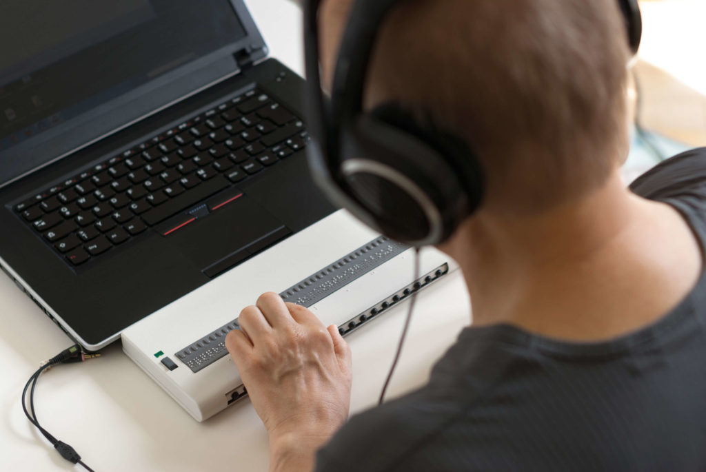
A screen reader is a piece of assistive technology that enables someone with visual impairment or learning disabilities to “see” what’s on a web page. It typically starts at the top of a website, reading off all text (including alternative text for images) into a speaker or headphones.
Some screen readers allow users to preview information on a site, such as the navigation bar and headings, so that the person can effectively skip to the pieces of content that are relevant to them. This is why it’s important to design clear navigation and use headings in a meaningful way.
Understanding how assistive technologies work and how certain impairments affect people’s online experience is crucial to designing a site that’s easy to use.
How to create an accessible website
Accessible design and user experience design go hand-in-hand. Like the title of the famous book on user-centered design by Steve Krug, don’t make people think. The main idea behind web accessibility is to create a user interface that’s easy to use and navigate. Things should behave the way a user would expect them to and navigation should stay in the same place throughout different pages on your site. Consistency is critical to accessible design.
Here are some things to consider to increase accessibility on your site.
Typography:
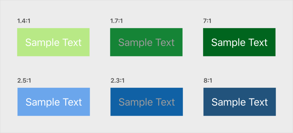
- Contrast. Text is easier to read on a website when the contrast between the text and the background is high. Use a contrast checker to see how your colors perform.
- Type hierarchy. Remember how we talked about the way screen readers use headlines to navigate through a web page? This is why it’s important to use your headings correctly. Typically, you’ll want to use only one H1 at the top of your page, followed by H2s to divide the content into related sections. Any nested elements under your headings should follow the subsequent order.
- Narrow widths. Text blocks are easier to read when they’re presented in sections with more narrow widths. WCAG recommends keeping the character count of a line of text to below 80 characters. A person should be able to zoom into the page 200% without needing to scroll from side to side to read the text.
Images, buttons, and icons:
- Alt text. Use alt attributes for all of your images. This is what will be read through a screen reader to interpret the image for someone who is visually impaired, so be sure to describe the actual image.
- ARIA labels. ARIA labels are attributes that describe an element’s purpose. They’re the only way to add descriptive text to things like buttons and icons so that visually disabled people can understand the purpose of these visual elements. They can be added to your HTML, and sometimes straight into page builders.
- Tap targets. Tap targets are areas that a user on a touch screen interacts with to carry out commands (think buttons and links). Make sure any tap targets are large enough that they can be easily pressed with a finger on mobile devices, or pressed with a keyboard for people who are unable to use a mouse. This doesn’t necessarily mean you need larger text – sometimes the padding or margin can be broadened to increase the size of the target.
- Color. Don’t use color alone to convey meaning. Color blindness is a common issue that causes some people to have difficulty seeing certain colors. So if, for example, you sell apparel on an ecommerce website, be sure to use text labels that identify clothing colors in addition to colored swatches.
- Interactive elements. Make any interactive elements easy to identify. Apply hover colors to links and buttons, and make links appear different from other text. Be consistent with the styles throughout your site to prevent confusion.
- Automatic animations. These are best avoided. If you do have video or audio that plays automatically, be sure to add obvious control buttons so that a user can manage them.
Accessibility for the win
Creating accessible websites doesn’t have to be difficult or expensive. The best part is it’s good for everyone. Accessible websites have higher SEO rankings, better search results, and encourage best practices in terms of usability, design, and coding.
The guidelines listed above are a good place to start, but there’s certainly more that can be done. Do your research and always continue to improve your practices. You may also want to consider getting an accessibility audit, reaching out to people in disabled communities, and performing user research and testing on your site.
Technology belongs to everyone and it’s our responsibility to make it accessible.